
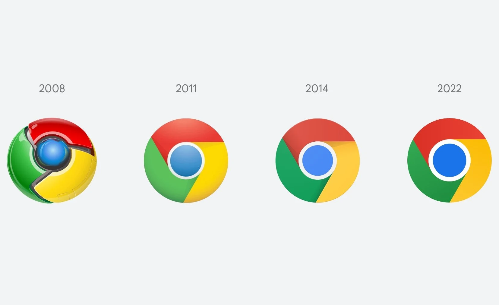
It's been 8 years since Google Chrome got any Icon makeover but recently, in the latest Canary build for Google’s Chrome browser, the company introduced an updated icon. As seen above, Google spared no expense at giving the updated icon a very nice, clean aesthetic. Compared to 2008’s Simon-lookalike logo, I think this is pretty good.
According to a Chrome designer who detailed the change via Twitter, quite a bit of work went into this change, leaving us to wonder how much a redesign like this might cost. As tweeted, “We simplified the main brand icon by removing the shadows, refining the proportions and brightening the colors, to align with Google’s more modern brand expression.”
Some of you might have noticed a new icon in Chrome’s Canary update today. Yes! we’re refreshing Chrome’s brand icons for the first time in 8 years. The new icons will start to appear across your devices soon. pic.twitter.com/aaaRRzFLI1
— Elvin 🌈 (@elvin_not_11) February 4, 2022
If you’re interested to learn more about the change, check out the complete Twitter thread. It’s pretty intense. You’ll soon see the updated icon across all of the various platforms in the near future. And yes, many of the platforms have variants of this new icon, confirming that Google takes this icon business very seriously. Or do they?
What do you think?


0 Comments